About Me

I graduated from the University of Wisconsin - Eau Claire (UWEC) in May 2012 with a B.A. in Criminal Justice. I returned to UWEC the following semester after finding out about a Geospatial Certificate. I took Geographic Information Systems I in Fall 2012 and loved it. I am taking the remaining 9 credits this semester (Spring 2013). Those classes include: Introduction to Remote Sensing, Geospatial Field Methods, and Geographic Information Systems II.

Friday, April 26, 2013

Raster Analysis

Goal

The goal of this assignment is to use multiple raster geoprocessing tools to build a model for both suitable sand mining locations and environmentally risky locations in Trempealeau County, Wisconsin.


Objectives

This assignment is in two partitions. The first involves creating a sand mining suitability model based on five criteria:

  1. Elevation
  2. Land use/Land cover
  3. Distance to railroads
  4. Slope
  5. Water-table depth

The second partition looks at the impact of sand mines on the environment based on the following six criteria:

  1. Proximity to streams
  2. Prime farmland
  3. Proximity to residential areas
  4. Proximity to schools
  5. Visibility from prime recreational areas
  6. Proximity to wildlife habitats


Sources and Datasets

Several datasets were used in this assignment:

The georeferenced bedrock geology map used in Objective 1 was obtained from the university's database. The digital elevation model (DEM for Objectives 1, 4, 12) and National Land Cover Dataset (NLCD for Objective 2) were obtained from the USGS. The rail terminals feature class (Objective 3) was obtained from the National Atlas. The water-table elevation map used in Objective 5 was obtained from the Wisconsin Geological Survey. The DNR Hydro (Objective 8), prime farmland (Objective 9), Parks (Objective 10), and Wildlife Areas (Objective 12) feature classes were all obtained from the Trempealeau County Dataset.


Suitability

Objective 1

The first objective was finding suitable land based on the elevation criteria. A georeferenced bedrock geology map of west-central Wisconsin was used in conjunction with contour lines generated from a DEM of the area. After substantial use of the swipe tool to compare the geology map with the elevation I was able to estimate the elevation range for both the Jordan (gold) and Wonewoc (red) formations. These two formations were stated in the lab as the two most desirable geologic formations for frac sand mining. I estimated the Wonewoc formation to be from 250-310 meters, and the Jordan formation to be from 330-370. With these two ranges in mind I did my first reclassify, which I did not feel turned out quite right, as I felt this resulted in the Wonewoc formation showing in too much area that it definitely was not (Figure 1). So, I decided to do a second reclassification, changing only the minimum of the Wonewoc range from 250 to 260. The resulting reclass can be seen in Figure 2. After examining the second reclassification, I felt it resulted in a greater amount of inaccuracy in the southern part of the county than increased accuracy in the northern portion, so I decided to stick with the first reclassification.

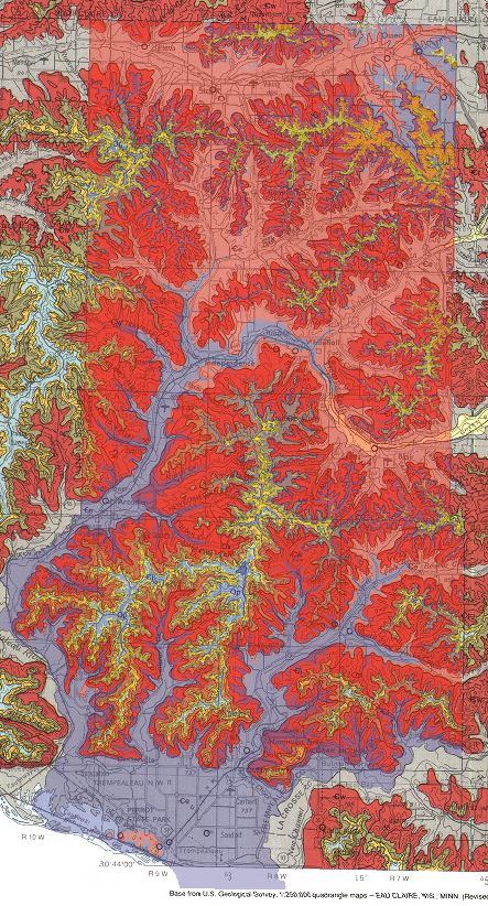
Figure 1: The first reclass overlayed on the
georeferenced bedrock map.  In the northern
part of the county, you can see much of the
valley area is not in blue.
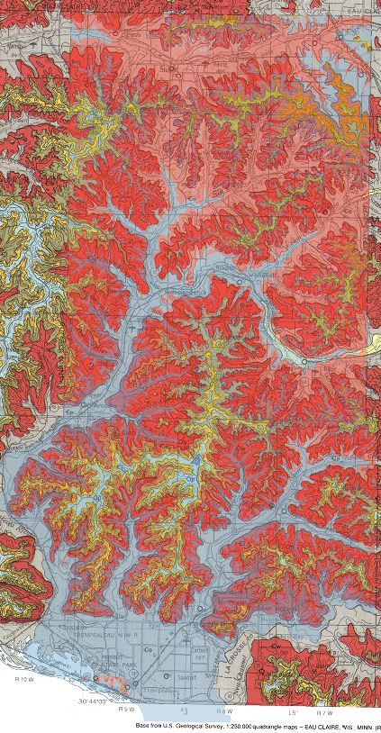
Figure 2: This second image was an attempt
to increase the accuracy of the northern part
of the county.  Unfortunately, not very much
was gained, but the southern part of the county
became a bit more inaccurate.
The following criteria ranking was used in this objective:

3 – Wonewoc and Jordan formations, since these are the most suitable locations
2 – Elevations between the wonewoc and Jordan formations, as this is small range and between the two ideal
1 – Elevations above and below the Wonewoc and Jordan formations, as these are most unsuitable.


Objective 2

The second objective involves finding suitable land based on land use criteria. Using a land use/land cover dataset obtained from the NLCD. Using the NLCD 2001 legend found here, I was able to determine what the numbers in the value field related to for land use. This objective requires two reclassifications. The first reclass ranks each value from 1 to 3, with 3 being the easiest to clear for the mine. The second reclass will be used in the raster calculator at the end of the suitability model to exclude those zones that are not useable at all, such as open water, developed space, and wetlands.

Figure 3: Image of table from Excel


Objective 3

Finding suitable land based on proximity to railroad terminals was the third objective. This should have been a rather simple process, as all that was required was to run the Euclidean Distance tool on the rail terminals feature class, and then reclassify the distances into three ranks, 3 being the closest. This was not so simple due to the euclidean distance raster being clipped and not covering all areas of Trempealeau county (when Trempealeau county boundary was used as mask it registered the whole county as the same distance). To circumvent this I had to create a large mask layer in the same projection around the area I wanted to be calculated. Once I created the layer and set it as the mask in the Environments settings, all was good.

Figure 4Screenshot of the euclidean distance ran and the size of the mask. My first mask
attempt was a square around Trempealeau county, but it did not work properly for
unknown reasons, so I created this one.  As you can see, the Euclidean Distance
goes far beyond Trempealeau County (outlined in red).
Objective 4

The same DEM from Objective 1 is used in this objective to determine the slope. The slope tool was ran with the output measurement parameter set to percent rise. The percent rise is a mathematical equation used to describe the slope of terrain, streets, roads, etc., with 100% rise being equivalent to a 45 degree angle. The focal statistics tool was then used to average the slope values to limit the “salt and pepper effect,” which is when pixels are erroneously ascribed the minimum or maximum value. A rectangular (3 cell by 3 cell) neighborhood and the mean statistics were used as parameters for the focal statistics tool. The resulting raster was then reclassified to the values seen in Figure 5.

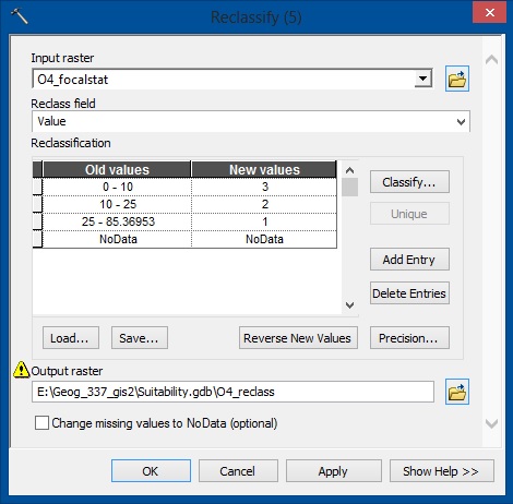
Figure 5: This is the Reclassify tool.  As you can see, all cells with values 0-10 will
be converted to 3, 10-25 will become 2, and above 25 will be 1.

Objective 5

Since the mined sand needs to be washed to remove fine particles, the ideal location of a mine requires the water table to be as close to the surface as possible. After downloading the water-table elevation map from the Wisconsin Geological Survey, the coverage file was projected and then converted to a raster using the Topo to Raster tool and the WT_ELEV field of the contours layer. With the water-table as a raster, it was then reclassified, with the closest to the surface being 3, and the further it was away would be 2, and then 1.


Objective 6 and 7

While objective six used the raster calculator to add all of the reclassifications, objective seven removed the exclusion zones by multiplying the raster calculator by the exclusion reclass. I decided to do both of these in a single calculation (Figure 6). In Figure 7, you can see the model used for the suitability assessment. All of the reclassifications can be seen in a Figure 8, and the final suitability model is shown in Figure 9.
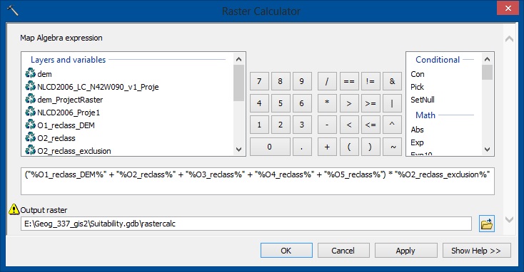
Figure 6: This screenshot shows the equation used to generate the map.
As you can see, it simply adds all of the rasters together, and then
multiplies them by the exclusion raster.

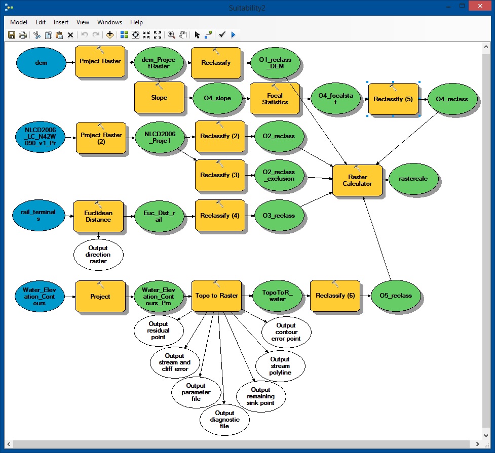
Figure 7: This is the model I created using ModelBuilder in ArcMap.
Almost all of my processes were ran through model builder.

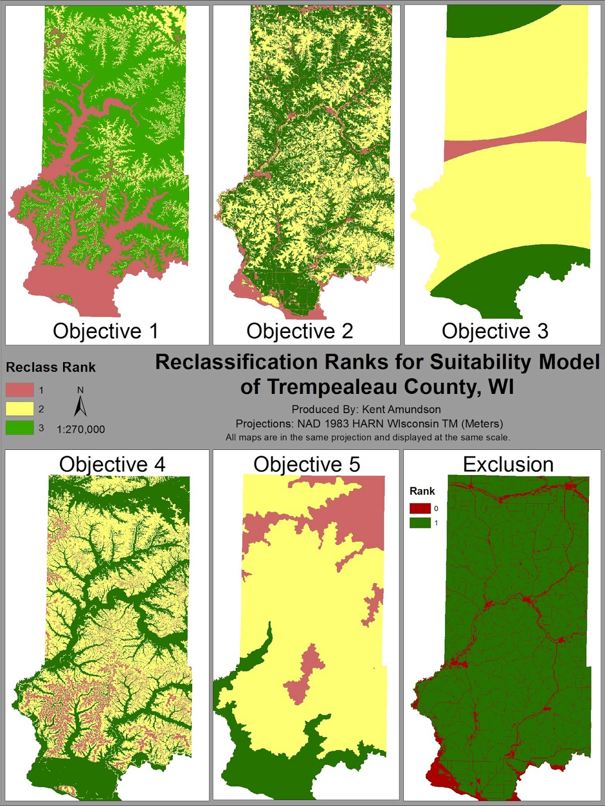
Figure 8: This image shows the resulting map for each objective
in the Suitability Model.
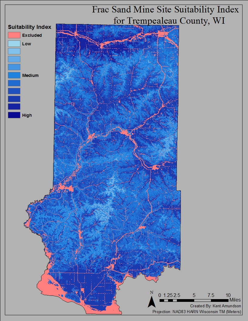
Figure 9: The final Suitability map generated from running the
Raster Calculator tool.  Using the equation found in Figure 6
resulted in this map.


Risk Assessment

For the risk assessment portion of this analysis, each objective will also use the Reclassify tool to create three ranks that represent the amount of environment risk in that area. A 3 will represent high environmental risk, 2 will be medium risk, and 1 will represent a low risk location. A single map in the final objective will show the map of each objective (Figure 11).

Objective 8

Objective eight used the Euclidean Distance tool to measure the distance land was from rivers. I classified areas within an eighth of a mile of rivers as a 3, areas between an eighth and half a mile as a 2, and beyond that as a 1. While there appears to be very few, if any, substantial impacts to rivers as a result of the mining process, these ranges were used to increase the distance, just in case.


Objective 9

Since Wisconsin is a large agricultural state, it would be very unfortunate to lose prime farmland to sand mines. With this in mind, a prime farmland feature class was converted to a raster, and then reclassified based on the attributes of each cell. If the land was prime farmland, is was classified as a 3. If it could be considered prime farmland if it was either drained or protected from flooding, it was classified as a 2. All other land was classified as low risk, 1.


Objective 10

Another issue with local communities and neighborhoods around sand mines is the potential dust and noise generated by the mining process. To reduce these issues, a sand mine must be at least 640 meters away from residential or populated areas. I used a composite boundaries feature class, and selected all of the areas considered to be city limits, then used the Euclidean Distance tool to measure the distances of each cell from those areas. Distances up to 640 meters were reclassified as high risk, those from 640 meters to 2 kilometers as medium risk, and everything beyond that was low risk.


Objective 11

Though most schools should have been included by using the city limits in the previous objective, it is important to be certain. For this reason, parcel data of the county was used, and all parcels owned by a school district were selected and the Euclidean Distance tool was used. The same classifications were used as in objective ten.


Objective 12

It would be quite sad if our beautiful parks and the views of nature they provided were restricted by the obvious sand mine off in the distance, so the Viewshed tool was used to find the areas of land that were visible from recreational areas. Two viewsheds were intended to be done, one on the parks and another on the trails, but technical issues arose, resulting in only one being completed. Using the DEM as the input raster, and the parks feature class as the observer feature, a viewshed was completed after about 15 minutes of processing time. Visible areas were classified as high risk, and all other areas were classified as no risk (0). The trails viewshed was attempted, but after six hours of processing time it was at only 8% completion and so was aborted.


Objective 13

The final factor before risk calculation was of my own choice. I decided that wildlife areas should be preserved as well, as I believe potential loss of wildlife is of environmental importance as well. As a result, I used a wildlife areas feature class and, again, ran the Euclidean Distance tool. I then reclassified the areas based using the same distances as objectives ten and eleven.


Objective 14

In this final objective, Raster Calculator was used to generate a map of the risk assessment for Trempealeau County, Wisconsin. Figure 10 shows the equation used to generate this map. In Figure 11 you can see the maps generated in each objective and the Risk Index used. The model created and used in ModelBuilder can be seen in Figure 12, while the final risk assessment map can be seen in Figure 13.
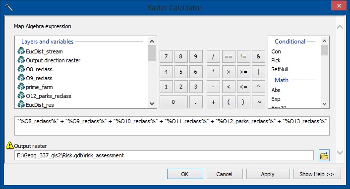
Figure 10: This screenshot shows the equation used to
generate the Risk Assessment Map.  As can be seen, it is
simply the sum of all the reclassifications.
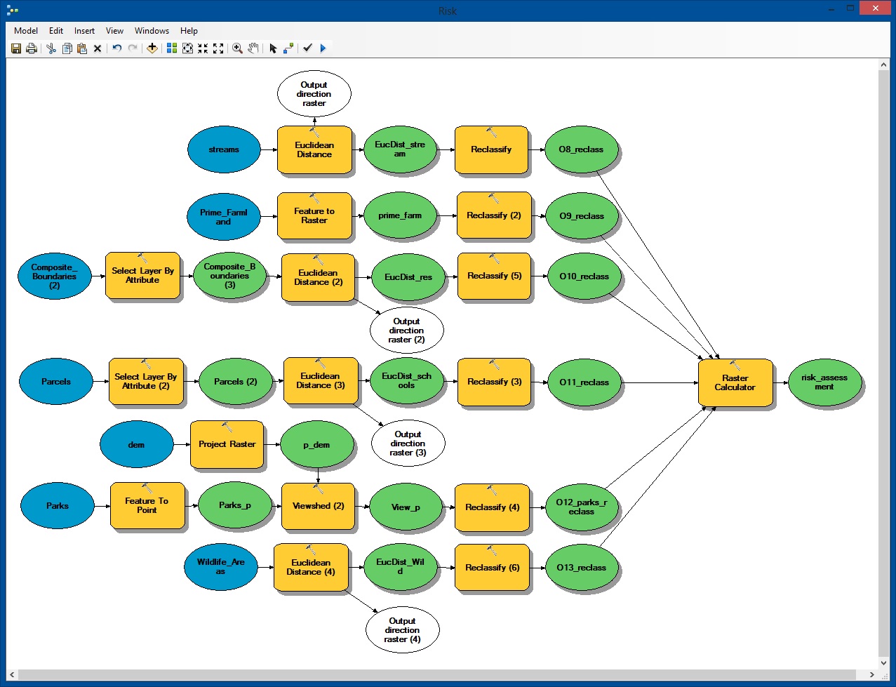
Figure 11: This is a screenshot of my Risk Model built using
ModelBuilder in ArcMap.  All tools were run using this model.

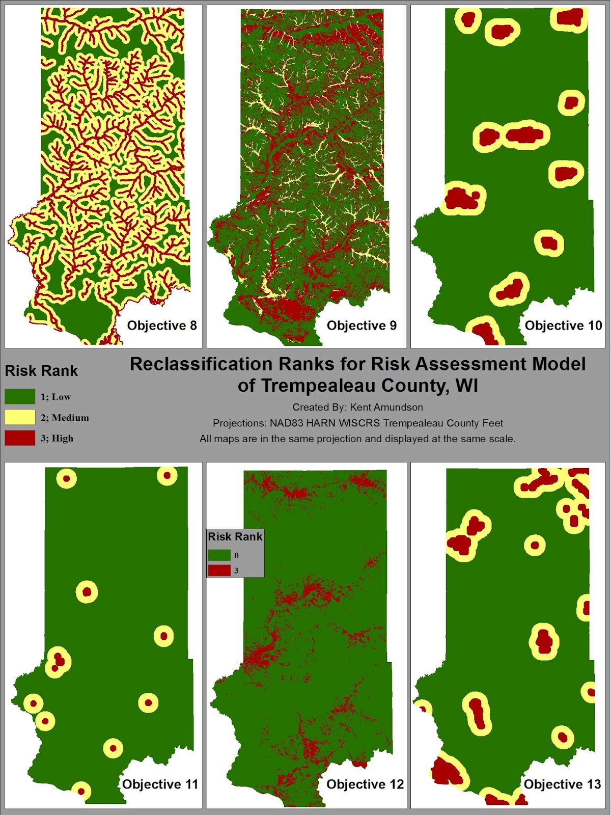
Figure 12: The maps generated in each objective can be seen
in this image.  

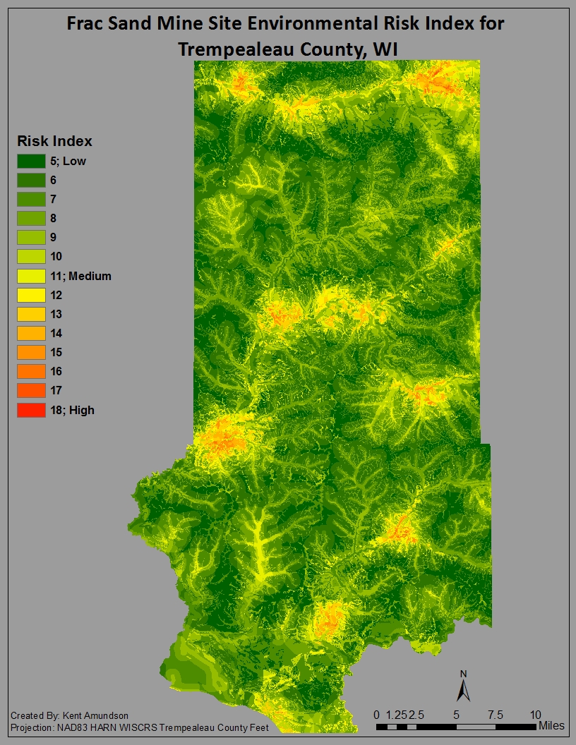
Figure 13: This is the environmental risk assessment map
generated by the raster calculator equation in
Figure 10.


Conclusion

Through this raster analysis two maps of use have been generated, one indicating the most suitable locations for mines, and one establishing the areas of greatest environmental risk.  Neither of them can be used alone without potentially causing issues.  If only the Suitability map were used, then a mine could be built without taking into account the environmental risks associated with that location.  For that reason, I created another map (Figure 14).  This map was created using the raster calculator to subtract the Risk Index from the Suitability Index, meaning each cell value in the Suitability Map would be subtracted by that same cells value in the Risk Map.  The resulting raster had cell values ranging from -17 to 10.

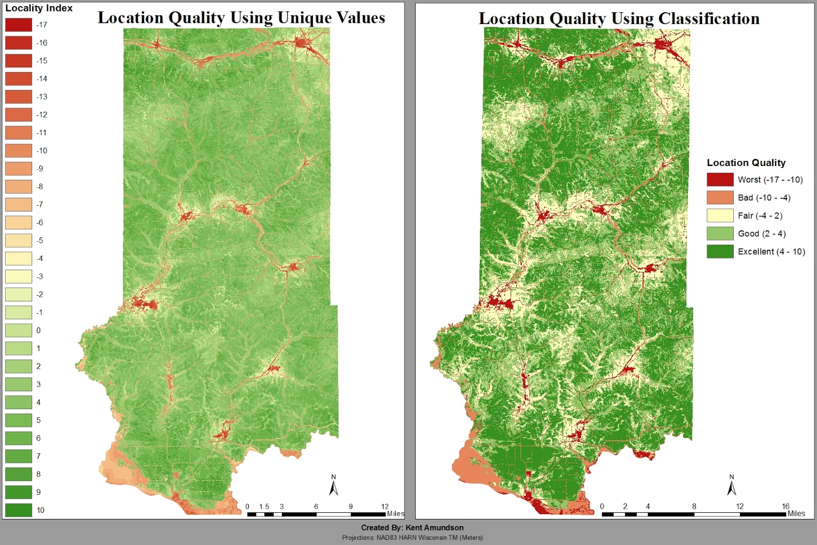
Figure 14: Two maps using two different methods in the Symbology tab.  These maps were generated using the
Raster Calculator.  The Risk Index was subtracted from the Suitability Index, resulting in cell values ranging
from -17 to 10.  The classification on the map on the right was done using natural breaks (Jenks).

Friday, April 5, 2013

Network Analysis of Frac Sand Mines in Wisconsin

Goal and Objectives
The goal of this assignment is to perform a network analysis on the transportation of sand from the mines to the nearest railroad depot via trucks. The trucks will have a substantial impact on the condition of local roads, which are maintained by the county.

This assignment is divided into the following six objectives:
  1. Load features into the Network Analysis Window
  2. Calculate a route
  3. Calculate a closest facility and route
  4. Build a model to calculate the closest facility route
  5. Calculate the cost of sand truck travel on roads by county
  6. Write a report based on the results (this blog is the report)

Data sets and Sources of Data
All data used in this analysis was obtained from ESRI, with the exception of mine locations. The mines were obtained from Wisconsinwatch.org, and the addresses were geocoded for this network analysis. A complete data set of railroad terminals could not be obtained due to many of them being private.


Methods

Objective 1: Load Features into Network Analysis Window

The first objective of this assignment was very straightforward. All that was required was to connect to a folder and add a streets network data set. Once that was completed we enabled the Network Analyst Extension of ArcGIS and imported the rail_terminals feature class that the professor provided for us. The final part of this objective was to add a combined mines feature class of all of the mines our group geocoded in the previous assignment. This proved to be more difficult than expected for me due to one group member dropping the class the first week, and then while waiting for the only other group member to import his feature class, I found out that he was dropping the class as well. As a result, I was unable to obtain the necessary mines, and so the professor provided me with another groups compiled feature class of mines (Figure 1).

Figure 1: Screenshot of the compiled mines feature class.  

Objective 2: Calculate a Route

The second objective was quite simple as well. All I needed to do was open the Network Analysis window and right click on stops to choose my mines feature class as the load location, accepting all other settings as default. Then I clicked the solve button and a route was generated. From here I could have exported the result as a feature class, but this is not useful to goal of the assignment. All this process did was calculate a route that would travel to all of the mines. What is needed is to find the most efficient route from each sand mine to its nearest rail terminal. Once we have that, we can calculate the length of the route by each county and estimate the cost to each county using a formula I create.

Figure 2: Merely a route to all of the mines.  This is not to be used for the actual analysis,
but rather was intended for us to see the result and learn how to use the tool.

Objective 3: Calculate a Closest Facility and Route

To begin Objective three I removed the route that was generated in the second objective, as it had no value and was cluttering the map. The purpose of this objective is the calculate a closest facility and route, which will allow us to find the closest railroad depot to each sand mine, as well as find the shortest route in mileage. To begin this process, I added a new closest facility layer from the Network Analysis toolbar. I loaded the mines as the facilities and the rail terminals as the incidents, and then solved. Upon examining the results, I noticed that this was the opposite route we wanted. This method found the closest sand mine to each rail depot, resulting in mostly completely unnecessary routes and very few connections with most sand mines (Figure 3a).

Figure 3a: This is a network analysis with the mines as the facilities and the rail terminals
as the incidents.  This resulted in a route from a rail depot to the nearest sand mine.  What
I needed were routes from each sand mine to the nearest rail depot.
To get the results I wanted, I had to switch the mines and rail depot, making rail depots the facilities and mines the incidents. Upon solving, I immediately saw this was the correct method, as there were routes going from each sand mine to the nearest rail depot (Figure 3b). To keep the map and table of contents clean, I removed the first calculation.

(Figure 3b: Correct Closest Facility)

Objective 4: Build a Model to Calculate the Closest Facility Route
This objective begins the creation of a model using the Model Builder present in ArcMap. Through this objective, the model will perform the same actions (and have the same results) as Objective 2. In Objective 5, we will expand this model to include calculating the costs incurred on counties from sand trucks traveling to and from the rail terminals.

The following process was used to create the model shown in Figure 4:
  1. Add tool: Make Closest Facility Layer (Network Analyst)
    1. Input Streets feature class, leaving all other settings on default
  2. Add tool: Add Locations (Network Analyst)
    1. Input Locations: Mines feature class; Set sub layer to incidents; all other settings on default
  3. Connect output of Make Closest Facility Layer to Add Locations tool of Step 2, and input network analysis layer
  4. Add tool: Add Locations (Network Analyst)
    1. Input Locations: rail_terminals feature class; Set sub layer to facilities; all other settings on default
  5. Connect output of Add Locations in Step 2 to Add Locations in Step 4 and input network analysis layer
  6. Add tool: Solve (Network Analyst)
    1. Connect output of Add Locations in Step 4 to Solve and input network analysis layer

I then ran this process to ensure it worked, however, the process said it could only partially complete, and it would not display on the map. I initially thought it was only partially completing due to there being 11 mines that were not completely geocoded and did not have matched addresses. To remedy this I started an edit session and looked in the attribute table of the mines. I found the 11 mines that had several fields with (null) values and no matched addresses. I deleted these from the attribute table, saved the edit, and stopped the edit session. This seemed to fix the partial completion, as this time it was fully successful, but it still did not display the results. Being confused by this, I decided to consult the ArcGIS Resource Center. I searched for “model builder not displaying,” and the first entry lead me to a tutorial on how to create tools with ModelBuilder (Tutorial can be found here). From there I found out that the output of a model will not be added to ArcMap unless you have both “Add To Display” and “Model Parameter” checked. This is because when a model is run from its tool dialog box, the “Add To Display” setting is ignored. When I ran the model with both of these checked on the Solve output, it successfully completed the model and added it to the display. The results were the same as found in Objective 3. Next I needed to export this result by adding processes onto the model I created.

Figure 4a: This is the model I created using the ModelBuilder in ArcMap.  This shows the
process explained above.  The 'P' above Closest Facility 2(2) denotes where I
had to select Model Parameter and Add To Display.

The following process was used to export the result in ModelBuilder:
  1. Add tool: Select Data (Model only tool)
    1. Go to Insert → Model Only Tools → Select Data
    2. Connect Solve output to Select Data, and Input Data Element
    3. Open select data tool, choose Routes for child data element
  2. Add tool: Copy Features (Data Management)
    1. Connect output of Select Data to Copy Features, and Input Features
    2. Open Copy Features, changed output workspace to my geodatabase

The model ran successfully. It created the feature class, but I forgot to add the “Add To Display” and “Model Parameter” to the Copy Features output, so I ran it again with these changes (Figure 4b). On this second run, I realized that it is necessary to have this as a Model Parameter because it allows you to change the output location and file name, which may be necessary if you run the model more than once. This completes Objective four.

Fig 4b: Model with added tools to export the Routes as a feature class. With the Add To Display
and Model Parameter selected on the Routes_final result, it will be added to the map
on completion.

Objective 5: Calculate the Cost of Sand Truck Travel on Roads by County

In order to calculate the cost of sand truck travel on the roads in each county, I needed to add some processes to my model. In my first attempt I merely intersected the routes feature class with a counties map, which resulted in an attribute table containing a Shape_Length field with really small values. After consulting a fellow classmate, I realized this was likely the sum of decimal degrees, as I had not projected both features into the same coordinate system.

My second attempt was successful. I projected both the routes and counties feature classes into NAD_1983_Wisconsin_TM_US_Ft. This is a Wisconsin State System that uses feet. I chose this coordinate system because it provided the smallest area that could be used effectively. A state plane system would be less accurate because it splits the state in half. UTM Zone 15N could have been used, but this is encompasses a much larger area, and so it does not provide as much accuracy as the state system. Wisconsin has two options for the state system, one in meters and the other in feet. I chose the one in feet since it would be the easiest and most accurate to convert feet into miles.

With the projections complete, I then intersected the projected routes (roads) with the projected counties. The intersect tool will provide me with an attribute table that links the truck routes to the county it is in. If a truck route goes into multiple counties, the intersect tool cuts the route at the county border. For example, if a truck route goes through three counties, at each county border the route will be cut, resulting in three line segments that each belong to a specific county. This will allow me to calculate the total length of roads in each county.

The final step to the model involves summarizing the Shape_Length field (which is the route/road length) based on the county. To do this I added the Summary Statistics tool and connected it to the output of the intersect. The output of Summary Statistics is a table, which can be seen in Figure 5a.

Figure 5a: This is the attribute table generated  by using the Summary Statistics tool.  The Name field contains
the name of the county, and the SUM_Shape_Length gives the total length of the routes in feet.

The model is now complete and can be seen in Figure 5b. However, I have still not completed objective five. In order to do so I will need to edit the attribute table generated by the Summary Statistics tool. First, I removed the frequency field, as that was just a count of the number of routes in the county. I also renamed the Name and SUM_Shape_Length to County and Road_Length, respectively. I added a Miles field to the table, and used the field calculator to convert the road length from feet to miles, using the formula depicted in Figure 5c. The final step was adding the Cost field, where I used the field calculator again to determine the cost to each county. The formula can be seen in Figure 5d. The formula used is hypothetical. It assumes that each mine takes 50 truck trips per year to the rail terminal, and then return to the mine. This results in 100 truck trips per year for each mine. The hypothetical cost is 2.2 cents per truck mile. The completed table and the cost to each county in dollars can be seen in Figure 5e.

Figure 5b: This is the completed model, showing the full process from start to the finish.  I reorganized the
model in order to make it more compact, allowing it to be more easily read and edited. 

Figure 5c: I used the Field Calculator on a new field to convert the total length of routes
in each county from feet to miles. The formula can be seen in the bottom box.

Figure 5d: Again, I used the Field Calculator.  This time the formula used will calculate the cost to
each county per year.

Figure 5e: This table was made in Microsoft Excel.  I exported the attribute table in ArcMap as a dBase, used a
statistics program to convert it to an .xlsx file, where I then opened it with Excel.  The Cost field shows
the cost to each county per year.

Results and Discussion
Figure 6: Created in ArcMap, this image contains a graph and chart of the cost to each county.  On the map,
you can see the routes from each mine to the closest railroad depot.  Counties that will bear a
financial burden are colored, with the cost increasing as the shade becomes more red.
The legend does not depict the proper color because I had the layer on transparency,
and I was unable to determine how to alter the legend colors.
As can be seen on the map, the vast majority of railroad terminals are located in the southwest portion of the state, where there are very few sand mines.  This results in most sand mines travelling to one of the three railroad terminals in west central Wisconsin.  When looking at La Crosse county, the southern most county in red, it only has one sand mine, yet it has the fourth highest annual cost due to most of the mines in the surrounding counties travelling to its railroad terminal.  

Our hypothesis assumes that there will only be 50 truckloads per mine each year.  This seems like an extremely conservative estimate, as that is saying each mine will only send about one truck per week.  Even so, it still demonstrates the proportion to which each county will be affected.  This means Chippewa, Eau Claire, Trempealeau, and La Crosse counties will have a significant impact on the deterioration of the roads, requiring more maintenance and potentially earlier and more frequent replacement.  This is certainly an issue to taxpayers within each county, as it is their tax dollars that will be spent in order to maintain and repair the roads.

Conclusions

While this analysis provides a general idea of the potential proportional costs to local communities due to the sand mines, it is neither definitive nor accurate enough to provide the answers people will want. There are many potential options to offset this issue, such as sand mines paying a fair share to each county they will affect, or creating more rail terminals in western Wisconsin to either reduce the number of trucks required, or at least reduce the distance they must travel.  This analysis does not provide the answers, but rather, points out the fact that more research is required in order to determine what the possible solutions are and which is the best course of action.